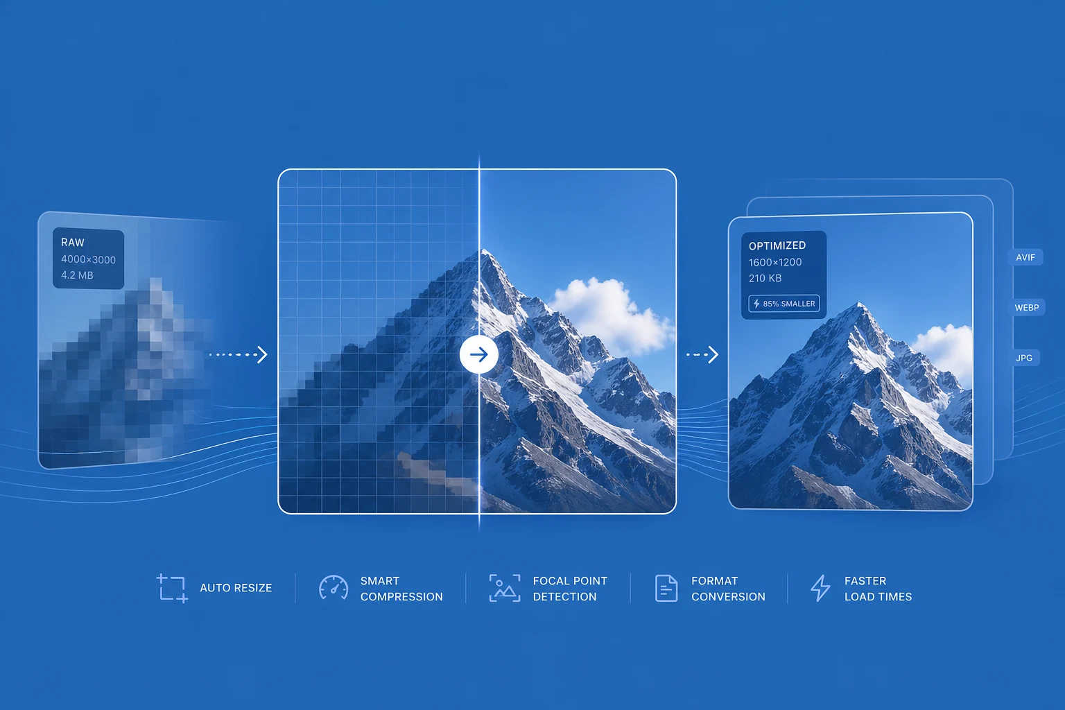
A single product image rarely has a single job. The same source might appear as a compact thumbnail in search, a product card in a grid, a high-resolution gallery image, or a social preview. Each placement needs a different output, but your team should not have to create and manage every variant by hand.
Thor Commerce makes image delivery part of the media URL. The Storefront API returns one stable source, while each storefront component describes the image it needs.
Why image delivery becomes a commerce problem
Images are often the largest assets on a commerce storefront. Product grids, PDP galleries, editorial modules, cart thumbnails, and Open Graph previews all need different dimensions, formats, and quality levels.
Creating those derivatives manually adds work to every upload. Variants must be generated, named, stored, synchronized, and invalidated. Over time, that process becomes difficult to keep consistent—and storefronts often end up downloading more image data than the layout needs.
Thor Commerce keeps the source media stable and moves transformation and delivery into the image pipeline.
How Thor image optimization works
A product image returned by the Storefront API includes a src value:
query ProductImages($id: ID!) { node(id: $id) { ... on Product { variants(first: 3) { nodes { image { src fileName contentType } } } } }}Treat that src as the starting point for optimized delivery. Your storefront appends the parameters required by the component. Thor normalizes the request, generates the transformed variant, stores it, and serves it through the CDN.
Equivalent requests are normalized into the same operation order, improving cache reuse even when different components construct their URLs differently.
A rendered URL can look like this:
https://cdn.thorcommerce.io/example-project/example.png?width=800&format=auto&quality=80Build responsive images at the component boundary
Image dimensions are a rendering decision. A product card may need 400 pixels, while a gallery may need 1200. Mobile and desktop layouts may also need different srcset candidates.
Let each component generate the URLs that match its layout:
<img src="{media.src}?width=800&format=auto&quality=80" srcset=" {media.src}?width=400&format=auto&quality=80 400w, {media.src}?width=800&format=auto&quality=80 800w, {media.src}?width=1200&format=auto&quality=80 1200w " sizes="(min-width: 1024px) 33vw, 100vw" alt=""/>The browser can now choose the most appropriate candidate for the current viewport and layout, while Thor handles the transformation and delivery behind each URL.
A small transformation API
The image API stays deliberately focused:
widthorw, andheightorh, control output dimensions. When only one dimension is provided, the image keeps its aspect ratio.formatorfcontrols output format. Supported values includeauto,jpeg,webp,avif,png,svg, andgif. For browser images,format=autolets Thor choose the best supported format for the request.qualityorqcontrols lossy output quality from 1 to 100.fitcontrols resizing behavior withcover,contain,fill,inside, oroutside.dprrequests a higher-density asset. For example,width=400&dpr=2is normalized towidth=800.
Explore the full image optimization API reference.
A practical storefront workflow
- Query
Media.srcfrom the Storefront API. - Let each component define the dimensions it needs.
- Generate
srcandsrcsetURLs from those dimensions. - Use
format=autofor browser-rendered images. - Set an explicit
qualitywhen you want predictable output. - Keep original upstream storage URLs out of storefront templates.
This creates a clean boundary: GraphQL provides the media reference, the storefront describes the desired output, and Thor Commerce handles transformation, caching, and CDN delivery.